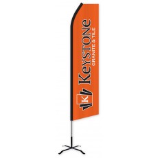
Custom Feather Flags are a great way to reach customers when they are outside of their homes, commuting to work, going shopping, walking around town, and generally going about their daily routines. When using feather flags, it is important to utilize an attractive, eye-catching design to capture the attention of these prospective customers rather than allowing them to pass by without noticing. A well-designed Custom Wind-Free Feather Flag or Custom Swooper Feather Flag can make a difference for your company’s exposure and create a long-lasting impression on your potential customers.
Our custom feather flags are printed with digital printing, which allows many options with respect to colors and shading. We can print any design ranging from a full-color photographic image to a vibrant design featuring bold color fields. With these options, come difficult design decisions. This article willoutline some important guidelines to follow when trying to design a custom feather flag that will stand out from the crowd.
Color Choices
Research conducted by the University of Loyola in Maryland found that color increases brand recognition by up to 80%. Choosing a custom feather flag rather than a stock design will allow you to choose specific colors for your flags so you can match your brands colors and help build this recognition.
Another factor to consider when choosing the color of feather flags is visibility. Research indicates that while black and white can grab an individual's attention for a third of a second, bright colors can capture their attention for whole two seconds. To maximize the attention-grabbing ability of a feather flag, select vibrant colors that will be visible from distance, such as red, green, yellow, or blue.
Although bright colors are the most striking, it is also important to limit your color choices to about 4 complementary colors or fewer per flag. Busy flags with too many colorsor non-complementary colors will be too difficult to decipher. The best solution is to use single-colored text on a single-colored background. Keep in mind that the colors of the flag and the text must be contrasting in order for the text to stand out. For example, red text on a yellow background will effectively make the message stand out; however, placing that same red text on an orange background will not reach the desired effect since red and orange are non-contrasting,complimentary colors.
Letter Size
The most important function of a custom feather flag is to deliver a message. With this in mind, the readability of text on your feather flag is critical.
A general rule to follow with any advertising signage is to size lettering at least one-inch tall letter per 10 ft. of viewing distance. For example, 24-inch letters will have the best impact within 240 ft. However, they will still be visible from further away. Our standard feather flags are 2.5 ft. wide, which allows for placement of very large text. If your design includes only 5 letters, you could make them as tall as 35-40 inches.
Two other important factors to consider when defining the letter size for your flag arethe use of white space and kerning. White space is the open area around the text. In order for your words to “breath” and for your flag to have better readability, your design should consist of 40% text and 60% white space. Effective use of white space will make your letters stand out and contrast with the background more efficiently. Kerning is the spacing between letters. Having large letters close together will heavily reduce readability of your text, so avoid spacing the letters too closely.
Font Selection
When choosing the font for your custom feather flag, keep in mind that you only have about three to five seconds to grab the attention of the drivers. Choosing a font that delivers your message quickly to potential customers is essential for your feather flag to be effective.If the text is difficult to read, people are likely to overlook it.
The most legible typefaces for outdoor advertising are Sans Serif fonts. Sans Serif typefaces, as opposed to Serif, have no angular lines extending from the bottom and the top. If you are looking for a very readable, bold text, try considering some of the most popular fonts from this category like Arial, Futura, and Helvetica. You should also keep in mind that thick letters will be easier to read, so a bold variation of any of these fonts will be ideal.Avoid novelty, script, and cursive typefaces, as they are very difficult to read. Serifs and text-style fonts like Times New Roman or Garamond should also be limited because of legibility concerns.
The smaller the text, the more important it is to choose a very readable font. When working with very large letters, you can sometimes choose fonts which are more stylized since the large size of the text can overcome some legibility issues.
Remember to select vibrant, attractive, and contrasting colors for your custom designs. Readability and legibility of the text are critical, so make sure to use large thick letters with appropriate amount of white space and kerning. These are just a few tips to help you design a custom feather flag which will successfully grab the attention of your audience. Keep your designs readable, straightforward, and to the point, as your audience may have only a few seconds to view your advertisement.

